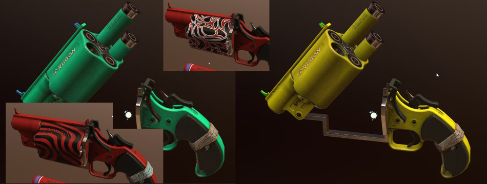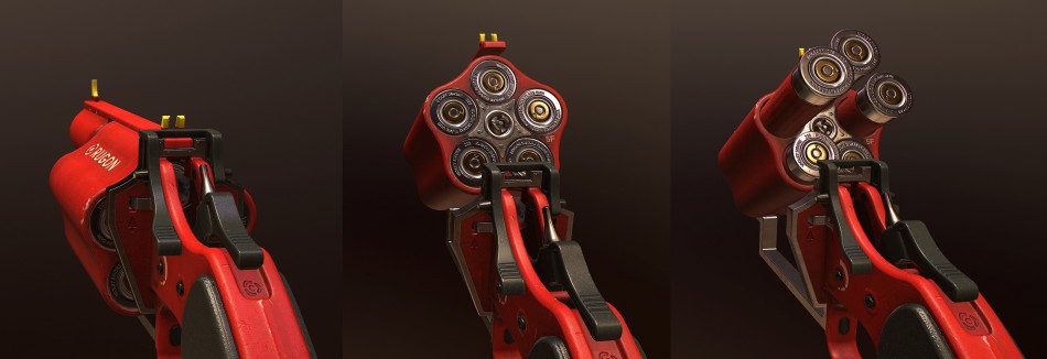
I don’t remember clearly how this concept came into my mind, but for me, it seemed to be cool idea, therefore I decided to do something more than initial sketch. Assumption wasn’t complicated: flare gun mixed with revolver. Only revolver which can be opened like Webleys (for instance) could come into play and it is caused by size of flares. I decided to made this gun for FPP, so I had to follow this kind of view rules.
-
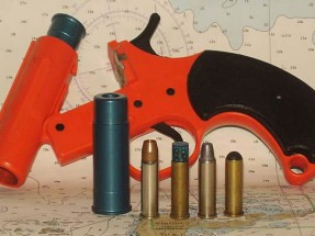
Orion Flare Gun
From: www.firearmstalk.com
-
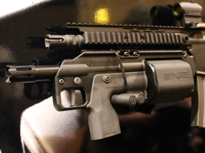
Shotgun attachment
From: www.thefirearmblog.com
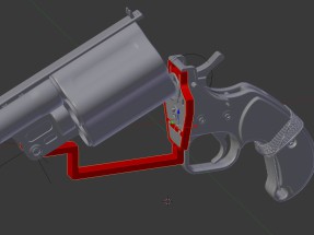
In the beginning I was considering only full plastic version (like in Orion). However after few tries it was obvious, that metal parts will get in sync with plastic ones and also will create impression of more solid construction. (Problem important especially in lower frame).
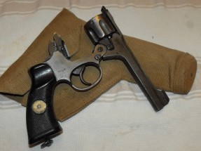
- From: picturearchive.gunauction.com
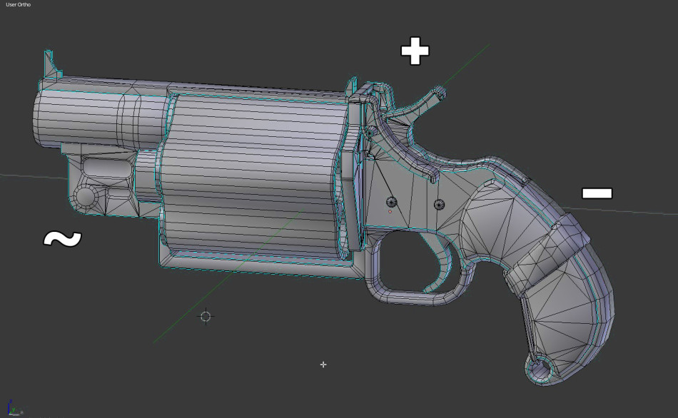
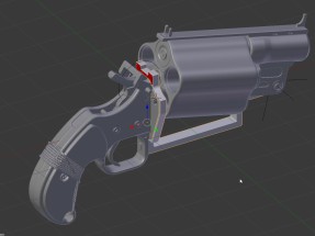
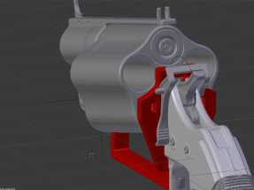
- Metal Frame – red part
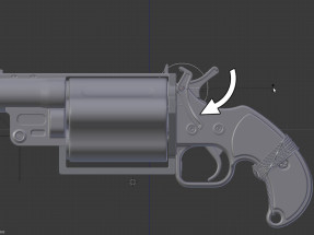
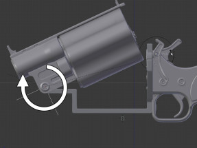
Designing whole process of reloading became considerable challenge, because it is necessary for FPP view to be able to open gun’s magazine with only one hand when the second is used to change flares in drum. After shot, drum is supposed to spin what is additional visual feature.
- Reload – first step
- Reload – second step
All elements which are out of FPP view have respectively lower scale on texture and lower number of polygons. Back of the gun, which is visible in view is the most pimped part of gun.
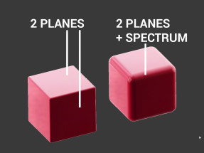
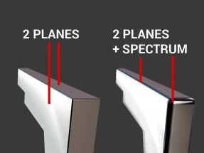
For me, especially fundamental thing in this model is attitude to contrast defining of materials and difference in way of modeling metal and plastic parts. Usually game artists create sharp edged plastic objects and this is the reason why these models don’t look attractive. Additionally observer have a problem with determining parameters of materials on which he actually looks (2 planes).
Let’s consider FPP view, in which after all models are holding statically. (What causes that reflections lie monotonically). I focused on ‘sharp’ metal (which owing to fact that it looks like gleaming metal is contrastable and easy to notice) and smooth plastic (what makes easier to identify it).
- Planes and spectrum
- Planes and spectrum in FPP view
When we create specific model of gun, we care about that player will be able to recognise at first glance what is the kind of gun. My model has a shape really unusual for guns of that type what makes him harder to recognise as flare gun. If I would resign from vivid, warning colours (these colours are standard for this type of gun) I would make it even more difficult to recognise. That’s the reason I stayed with monotonous red colour.I’m a big fan of all kind of fancy paintings on weapons (e.g. in BRINK, DIRTY BOMB). Unfortunately in this case nothing like that happened. I was testing many various types of colours and paintings and only red or orange was fulfilling. It’s the result of one simple reason:
On model there are visible signs of use. I focused more on interesting contrast play of plastic/metal than structural effects of more used material.
When we make model to game it’s necessary to remember that nothing is brand-new. Always we have to keep in mind that in game it could be used umpteenth time and texture won’t change. All dark dots, soot or other parts pollutions I made by negatives of exploding fireworks or galaxies. Thanks to that fact soot etc is not exaggerated slime, they’re just creating a subtle impression.
Black plastic parts were replaced with gray-green ones, because imo it’s not advisable to contrast (black-white) albedo so much. High contrast should be a result of post process. Obviously green is colour fulfilling red, so overall contrast between plastic parts is well kept.
From technical point of view- texture bases generated in dDO. I bet on metalness, because it seemed completely sufficient to obtain intentional effect.
Things that didn’t come as good as they supposed to:
- String, by its regular, mathematical formula looks like CGI from 20 years ago. Additionally I abused hard ambient occlusion there.
- Plate in FPP view it’s the try to save strange shapes near camera when everything is closed. It’s the weak and forced solution. Nevertheless it looks better with than without but it doesn’t make this method good enough.
- Coffin with its shape isn’t exactly like it should be to satisfy me and sign up in convention.
- Top of model is over-contrived a bit, there is lack of something what could bond whole model together. I can say it’s overwrought design.
- When we talk about designing mechanisms, it’s absolutely essentially to have simple animation of working. I of course had created one, but I didn’t attach it in presentation what was a big mistake.
- Coffin-like shape – red part
In result I’m pleased of some of the stuff and with other things a bit less. But in general ratio of time spent on model to quality of it, is quite OK I guess. It was one of these things which you make up, create and draw conclusions meanwhile having a great time with it.
