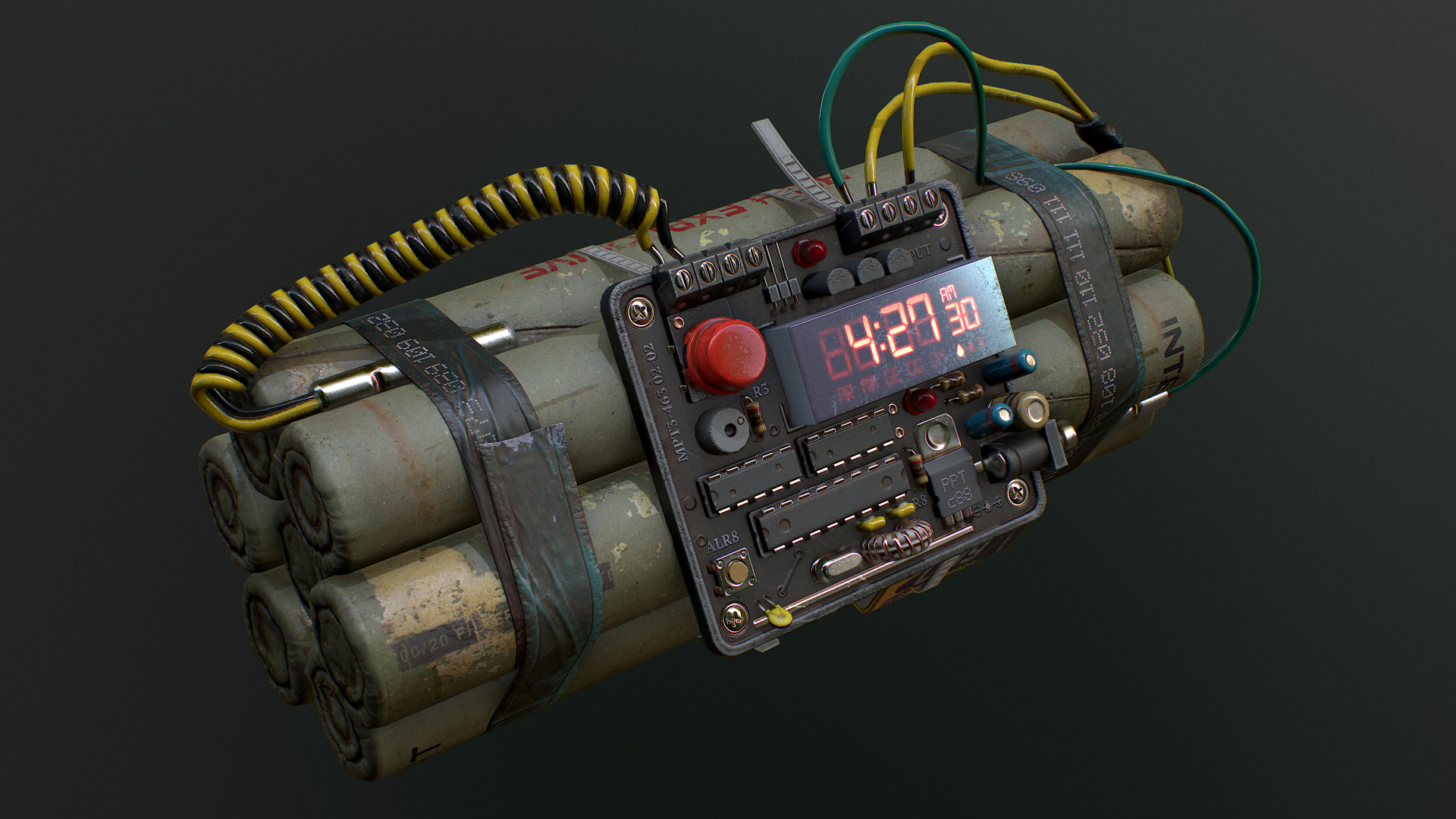
Some time ago I made a simple model of a bomb. Nothing really ambitious. I just wanted to do something smaller within a few days.
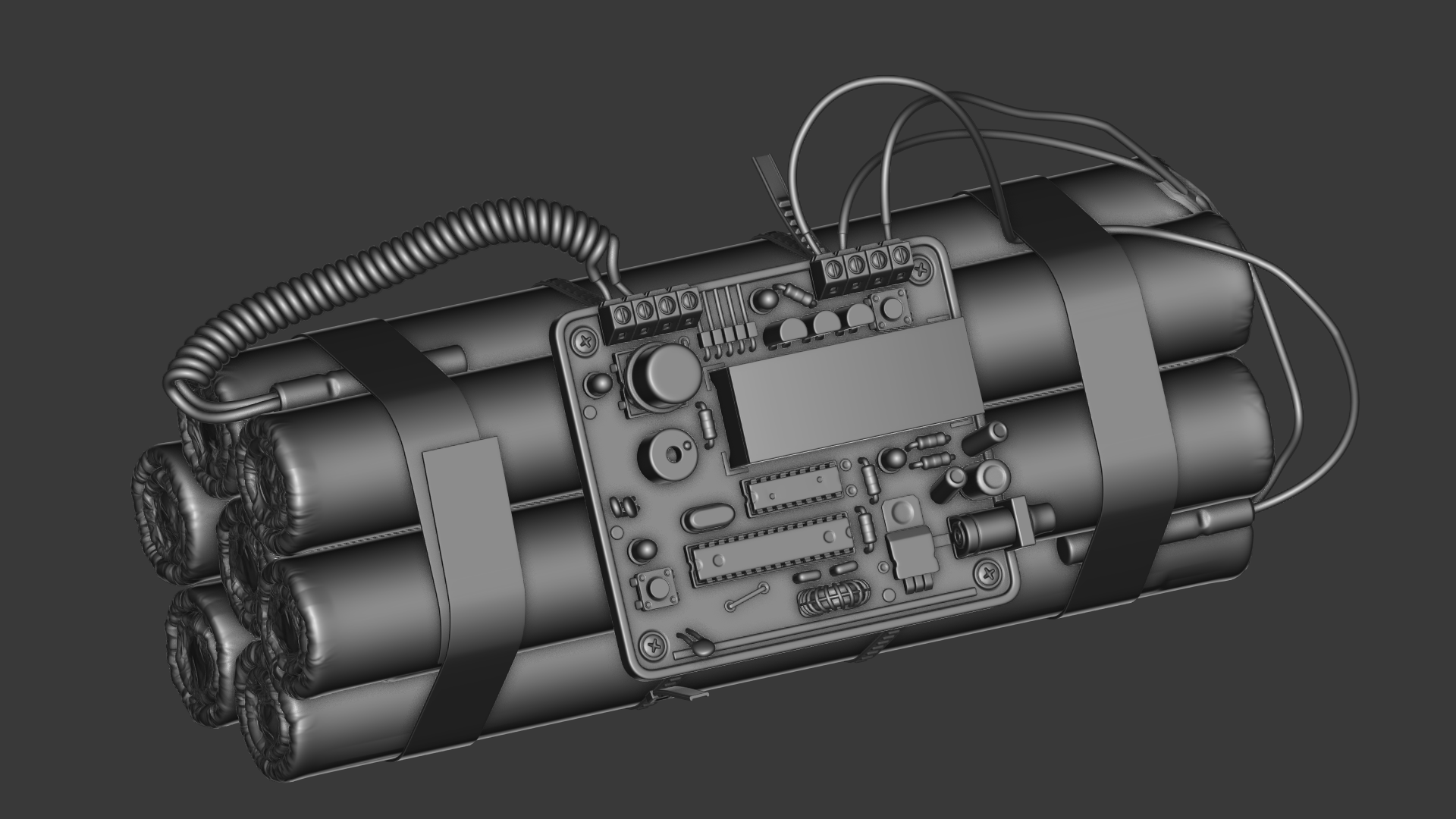
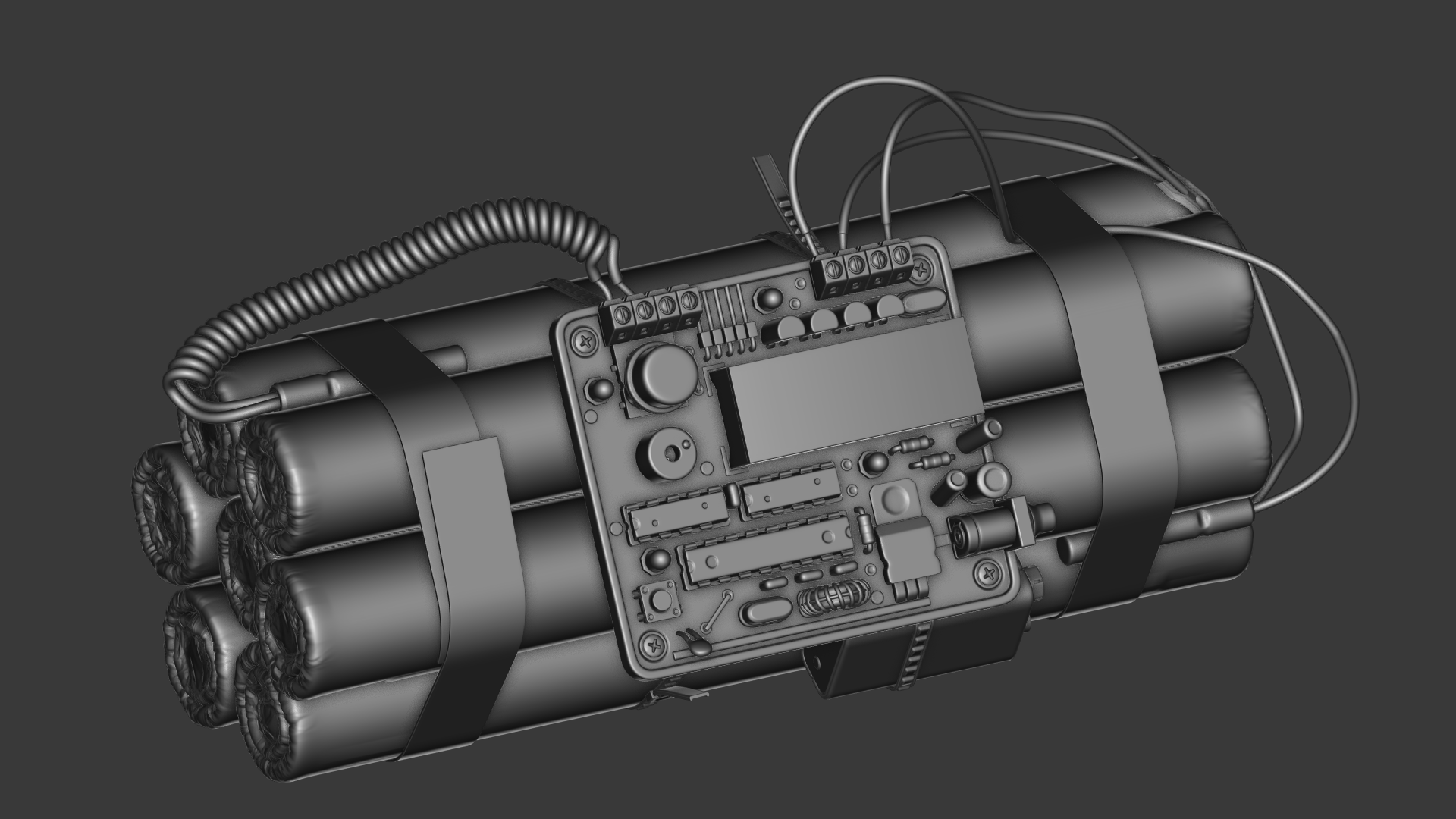
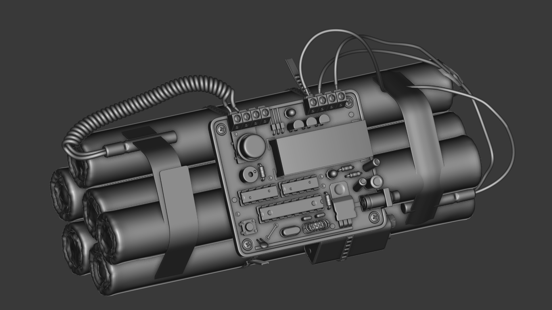
Working on details took majority of the time. I’ve made a few versions of the electronic circuit. Each iteration made the model more truncated, more iconic, more game like. This step turned out to be a good one – the level of details harmonized much better with TV/ monitor screen. The full composition of all elements was more polished and justified than the original version. I would even say that from the artistic point of view, my version was much more attractive.

A few weeks after publication of my version, I came across the following model:

Léandre Hounnaké, Countdown.
From: https://www.artstation.com/artwork/91ykL
Only then did I realise that I’ve missed something, haven’t managed. I blamed it on simplifications. My bomb seemed to be a truncated version of reality. On the other hand, some questions that kept coming back to me made me believed that the reduction of details was necessary for sake of the medium:
- Could I get equally cartoonish/ emphasised shapes that add character to the bomb and keep higher intensity of details?
- Would the high-detailed object be still as clear?
- What’s the reason of investing in a detail that serves no purpose?
Still however, the realistic version of bomb kept hunting me. It seemed richer. Then, I asked myself a question: If we have to reduce the detail, how to make up for it?
It looks much clearer when it comes to designing a logo:

Logo by DaveGraphics.
From: http://www.thelogomix.com/more/DaveGraphics
This example shows that by eliminating details, a new value can be added. Such a picture speaks to a viewer, suggests something that goes beyond the presented meaning.
Were the udder more realistic, the picture would be disgusting and improper.
A realistic looking ceramic mug would not draw our attention to the udder, but to the material. There is no other choice in that situation. The picture has to be simplified to convey what the author had in mind. This move is also beneficial when it comes to the medium the logo is to be presented on, a printout.
I have reduced everything in the bomb only because of the medium what, as a result, made it look like a empty shell, a trivial caricature. The simplification I’ve used serves no reason, apart from making the object more readable.
What can such an easy object present, apart from itself? How, conceptually, should the lack of details be compensated, when we talk about such a simple prop?