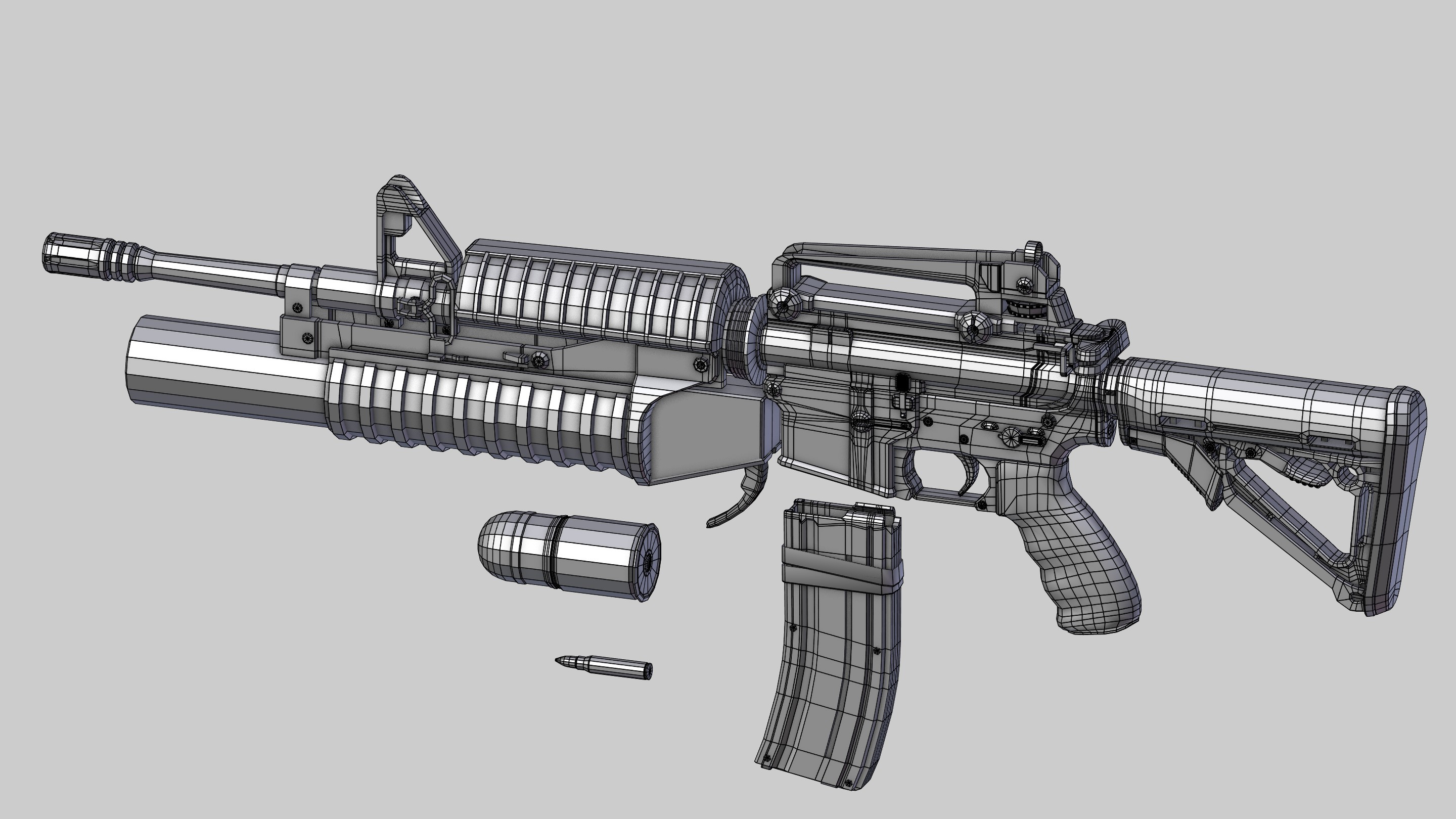
5. Basemesh i highpoly
5.0. High poly object
When buying a game players expect it to have „good graphic and lots of details”. Meeting these criteria is not as easy as it seems.
The stage of basemesh object creation can be divided into two separate sub-stages:
- giving an adequate shape – more precise divisions, carvings, transfer of forms, giving character to given parts,
- minor details – screws, threads, small indentations, dentations.
Shaping is about polishing a silhouette. About adequate sketching everything that should be included on an object to make it look more authentic. Define better the elements which proportions, dimensions and shapes were set in the whitebox.
Next we can go into details. It is all about setting small parts skillfully so that they would complete the bigger ones, not randomly spreading thousands of small objects on the surface.
An object prepared in such a way is not ready to be baked yet. However, it has all the necessary elements, drafted shape, character of the surface and the way of its smoothening already determined.
If the basemesh object is created in a software for polygonal modelling, I would recommend to base the mesh on quads. Thanks to that it will be easier to adjust the grid in the next stage, creating a subdivided object – high poly.
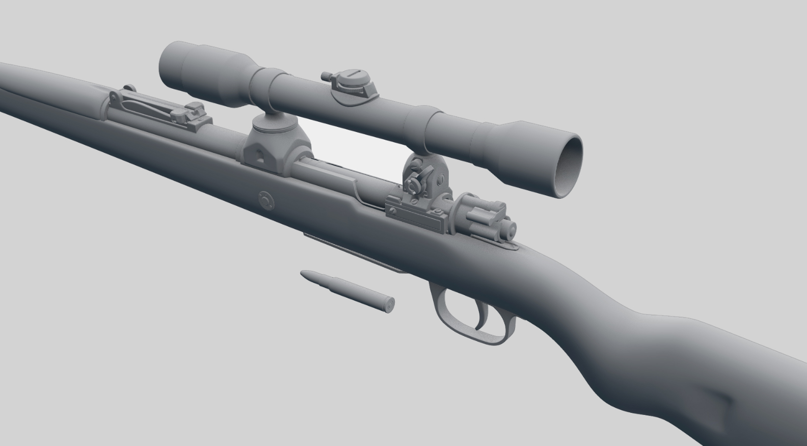
5.1. Significant features of an object
Looking carefully at any weapon it is easy to notice which elements are vital – key to the object. Older games or the mobile ones show it nicely. Due to technical limitations (number of tris, textures resolution, displays’ resolution and size) artists were made to present the essence. A part of irrelevant details was eliminated and those key ones highlighted.
![Ben Bolton. Lowpoly Guns [portfolio online]. 2015, source: https://www.artstation.com/artist/benbolton](https://piratportfolio.com/fpp_eng/wp-content/uploads/2015/08/5.1.A_I.jpg)
![Ben Bolton. Lowpoly Guns [portfolio online]. 2015, source: https://www.artstation.com/artist/benbolton](https://piratportfolio.com/fpp_eng/wp-content/uploads/2015/08/5.1.A_II.jpg)
Nowadays, we have reached the stage of so high resolution that we can show all details of realistic weapons (and even add a few more). But we still need to remember to show the essence, to choose those forms, shapes and objects that are important, and highlight them.
Of course, apart from the key details there are also other, the smaller ones. Analyzing an object it is worth to create the hierarchy of importance ‒ a pyramid. In such a way we can easily determine which elements are important and influence the others.
![<b>Heckler & Koch HK69A1 - 40x46mm</b> [online]. <i>source: http://www.imfdb.org/wiki/Heckler_%26_Koch_HK69A1_grenade_launcher</i>](http://piratportfolio.com/fpp_eng/wp-content/uploads/2015/08/piramida1.jpg)
![Reno Levi. <b>Call of Duty - Ghosts</b> [portfolio online]. 2013, <i>source: https://www.artstation.com/artwork/2qaA</i>](http://piratportfolio.com/fpp_eng/wp-content/uploads/2015/08/5.1.B_IIII.jpg)
![Valve Corporation. <b>Portal 2</b> [PC]. Valve Corporation, 2011, <i>source: http://www.playstationlifestyle.net/2011/01/21/hop-into-a-new-world-with-portal-2-screenshots/portal-gameplay-03/</i>](http://piratportfolio.com/fpp_eng/wp-content/uploads/2015/08/5.1.C_IV.jpg)
5.2. The scale of elements
When choosing elements we should bear in mind that the further from the camera, the less space on the screen they take (according to perspective). If some elements are important (e.g. a fore sight) we can scale them up a little bit. We should not, however, scale up the distant parts, as it can cause imbalance in proportions of the whole weapon (the form will look bulky).
Similarly to what I have written about designing the silhouette, too subdivided lines parallel to the screen’s edge are problematic. Props created that way are irritating to the viewer’s eyes. For that reason it is necessary to redesign some parts of a weapon to make them look better and more functional in the frame. It is a good idea to restrict the number of divisions or to make more space between them. The intensity of correction made to a given part depends on its distance from the camera and on the angle it is set at.
Reduction of the indentations at the side of Tommy Gun or at its barrel is a good example.
![Infinity Ward. Call of Duty 4: Modern Warfare [PC]. Activision, 2007, source: https://i.ytimg.com/vi/9Yx1Xz9KtLo/maxresdefault.jpg](https://piratportfolio.com/fpp_eng/wp-content/uploads/2015/08/5.1.C_III.jpg)
![Ben Garnell. Dirty Bomb - Pistols [portfolio online]. 2015, source: https://www.artstation.com/artwork/dirty-bomb-pistols](https://piratportfolio.com/fpp_eng/wp-content/uploads/2015/08/5.1.C_II.jpg)
![Ben Garnell. Dirty Bomb - Pistols [portfolio online]. 2015, source: https://www.artstation.com/artwork/dirty-bomb-pistols](https://piratportfolio.com/fpp_eng/wp-content/uploads/2015/08/5.1.C_I.jpg)
Due to perspective foreshortening and distancing the object from the camera ‒ in some extreme cases it is allowed to change circles into ellipsis. Such a change can be advantageous for the look in FPP projection ‒ a given shape will look round and will be more visible.

5.3. Module and the minimal size
An aspect which is also worth mentioning is creating elements on the basis of a module. Such rigorous attitude is not popular, thou, worth considering. If we set some minimal size (for example dimension of a screw) the rest of elements should somehow derive from its size (for example: the diameter of a barrel is equal the diameter of 3 screws, the width of the handle is equal to 10 screws and the weld equals ½ of the screw, etc.) It is an idealistic assumption but sticking to some rule guarantees very coherent look. It is worth using it if not for the whole weapon, than for the smaller parts (screws, knobs, buttons, and smaller cylinders).
![Patrick Sutton. AKS-74u with Kobra Sight [portfolio online]. 2015, source: https://www.artstation.com/artwork/zDvxQ](https://piratportfolio.com/fpp_eng/wp-content/uploads/2015/08/5.2.A_II.jpg)
![Patrick Sutton. Berthier Carbine with PE Scope [portfolio online]. 2015, source: https://www.artstation.com/artwork/Vy62b](https://piratportfolio.com/fpp_eng/wp-content/uploads/2015/08/5.2.A_I.jpg)
It is acceptable to include very small details, indents, incrustation, etc. You should check, however, if those elements will not make noise.
5.4. Modelling per-pixel
Due to the fact that we are dealing with a vector graphic (3D in this case) creators often forget about the target scale and about the way an object will be seen.
![Ubisoft Montpellier. <b>Rayman</b> [Playstation]. Ubisoft, 1995, <i>source: http://www.firerank.com/liste/lequel-de-ces-jeux-vieux-de-20-ans-vous-rend-le-plus-nostalgique-photos/3966</i>](http://piratportfolio.com/fpp_eng/wp-content/uploads/2015/11/5.3.A_III1.jpg)
![SCE Studio Cambridge. Frogger [PC]. Hasbro Interactive, 1997, source: http://www.abandonia.com/en/games/29609/Frogger+(3D).html](https://piratportfolio.com/fpp_eng/wp-content/uploads/2015/11/5.3.A_II.png)
![SCE Studio Cambridge. Frogger [PC]. Hasbro Interactive, 1997, source: http://www.mobygames.com/game/frogger_/screenshots](https://piratportfolio.com/fpp_eng/wp-content/uploads/2015/11/5.3.A_I.jpg)
The medium in which a particular work is fixed has an immense influence on its appearance. In painting it’s the canvas and paints, in sculpture material that was used in its creation, etc. In modelling to video games it is taking the screen into consideration that is worth doing, i.e. targeted resolution in which an image will be projected.
Weapon in a game is visible in almost invariable scale (it takes up the same surface all the time) therefore, it is easier to estimate whether a detail is not too small in the ration comparing to the number of pixels fall. So technological approach allows to create harmonious and coherent objects. Per-pixel modelling resembles a little pixel-art with the usage of vector graphic. Being aware of the possibilities and limitations of a screen, we can make conscious and wise decisions.
![Arkane Studios. Dishonored [PC]. Bethesda Softworks, 2012](https://piratportfolio.com/fpp_eng/wp-content/uploads/2015/11/5.3.A_IV.jpg)
![Arkane Studios. Dishonored [PC]. Bethesda Softworks, 2012](https://piratportfolio.com/fpp_eng/wp-content/uploads/2015/11/5.3.A_VI.jpg)
The most important parameters, determined by the matrix, are as follows:
- elements’ scale (Is an object clearly visible?) Is its perception in this scale clear? Would that be advantageous to scale up some elements?
- shape (Does the weapon has understandable, clear form when projected in the target scale on the screen?) Maybe it is worth resigning from part of details for the benefit of more iconic parts?),
- Amount of detail (Do the small elements or too intensive contrast details create noise?)
- the width of bevels
- sharp edges can create artefacts ‒ jagged pixels,
- too sharp edges contribute to reduction of reflections. As a result it is difficult to determine the material an element is made of. Click to get more information.
- one more, extremely vital, reason for which it is good to round edges is the texture resolution. In a situation when there are few pixels on our bevel on the UV, the object will be very angular after baking (we will have an impression that a normal map is missing). The width of bevels should go together with the size of UV map. The lower the resolution, the rounder the object should be,
- edges should also be softer relating to the distance to the camera. It’s caused by amount of pixel destined for part and also by anti-aliasing. Further elements such as the weapon front (muzzle, barrel, silencer) should have wider edges, while closer ones (hammer, bolt, gunbody cover) – sharper.
![Racer 445. <b>Normal_edge_thickness</b> [online]. <i>source: http://wiki.polycount.com/wiki/Normal_Map_Modeling#Edge_Thickness</i>](http://piratportfolio.com/fpp_eng/wp-content/uploads/2015/11/Normal_edge_thickness1.jpg)
5.5. Contrast
Almost all pieces of art are based on some contrast. It is the combination of two contrasting elements that is interesting to us.
Introducing contrast is one of the best ways to make a project more attractive. What is more, it exposes differences between elements. source
Acquiring contrast (diversity) in case of material is an issue associated mainly with texturing. However, it is the object itself that can tell us all about the material it is made from. The best reference can be a Renaissance sculpture. The differences in parts of material combined with parts of body are very well seen. Similar tricks can be used in weapon modelling.
![Michał Anioł. Madonna z Burgii. 1503. [online], źródło: http://static.turistipercaso.it/image/b/belgio/belgio_tgu3t.T0.jpg](https://piratportfolio.com/fpp_eng/wp-content/uploads/2015/11/5.4.A_II1.jpg)
![Michał Anioł. Pietà watykańska. 1500. [online], źródło: http://eyesoffaithdc.com/?p=332](https://piratportfolio.com/fpp_eng/wp-content/uploads/2015/11/5.4.A_III.jpg)
The basic question worth asking is: Which elements should be separated, contrasted? To answer this question we can use one of the following criteria:
- diversification by the degree of use – e.g. new versus old,
- diversification by material – e.g. plastic versus metal,
- diversification by the way a given element is produced/ manufactured – e.g. casting metal versus stamped metal.
Once we know what to separate, we should determine the way to acquire the contrast. It can be:
- the number of details – e.g. smooth metal; rough plastic,
- the width of bevels – e.g. used elements: smoothen; new elements: sharp
- number of divisions – e.g. leather: a lot of small bits; metal: one, a big form.
- scale – e.g. metal: small parts; plastic: big surface,
- the way of connecting it with the main part – e.g. casting metal: merged with the other elements; chromium: independent.
![Pedro Amorim. <b>Homebrew Shotgun</b> [portfolio online]. 2014, <i>source: http://www.edgesize.com/index.html</i>](http://piratportfolio.com/fpp_eng/wp-content/uploads/2015/11/pobrane.png)
Ewa Brzozowska. Art of contrast blog.racymind.pl [online]. 2014.
source: http://blog.racymind.pl/design/sztuka-kontrastu/
source: http://blog.racymind.pl/design/sztuka-kontrastu/
5.6. Micro-detail
The PBR makes us create detailed normal maps. Obviously, some part of an element can be imposed while texturing, however, not on the high poly stage. Not only does it allow for better manipulation of that elements, but also enables creation of less subdivided high poly objects (less subdivided object can be baked faster and facilitates smoother run on slower hardware).
Things which are worth including on the normal map are as follows:
- microsurface details – very small bulges, scratches. Everything in almost micro scale.
- materials’ textures – texture plait, rough plastic, etc.,
- inscription / logos,
- patterns – defined, repeated design, e.g. stampings on metal,
Due to difficulties in maneuvering and problems with the adequate settings in the texturing process, details oriented in a given spot should be placed on a high poly object.
Vast majority of weapons have different inscriptions, serial numbers, producer signs and so on. Typography placed on weapons aims at giving them features of real objects. The scales of scopes measurement usually do not go in line with the game’s mechanics, therefore, we have wide margin of maneuvering. All designations serves purely the decorative purpose. They should harmonize nicely with the whole and shouldn’t be too pushy.
The typeface should be adjusted in relation to its application. The shape of letters is definitely different depending on whether they are stamped in metal, painted or cut with a knife.
![Yaron Levi. <b>M1887 Call of Duty: Modern Warfare 3</b> [portfolio online]. 2013, <i>source: http://yaron-levi.squarespace.com/call-of-duty-modern-warfare-3/</i>](http://piratportfolio.com/fpp_eng/wp-content/uploads/2015/11/5.5.B_I.jpg)
![Alan Van Ryzim. <b>BattleRifle</b> [portfolio online]. 2015, <i>source: http://polygoo.com/battlerifle</i>](http://piratportfolio.com/fpp_eng/wp-content/uploads/2015/11/5.5.B_II.jpg)
One of way to make the surface full of micro-details is to sculpt it. Personally, I believe that sculpting the whole weapon is a mistake. An object loses its shape and becomes a shapeless „snot”.
If we decide to sculpt, it should be used more to contrast the given material than to gain micro-details. Even when creating free forms (e.g. a forged axe or a dragon paw) it is better to contrast the freely sculpt places with sharp, precise forms.
![Reno Levi. <b>Call of Duty - Ghosts</b> [portfolio online]. 2013, <i>source: https://www.artstation.com/artwork/2q3y</i>](http://piratportfolio.com/fpp_eng/wp-content/uploads/2015/11/5.5.C_III.jpg)
![Pistolet czarnoprochowiec skalkowy [online]. source: http://imged.pl/pistolet-czarnoprochowiec-skalkowy-2650683.html](https://piratportfolio.com/fpp_eng/wp-content/uploads/2015/11/5.5.C_I.jpg)
![LONG climbing shotgun XVIII century [online]. source: http://globalreplicas.com/en/long-climbing-shotgun-xviii-century.html](https://piratportfolio.com/fpp_eng/wp-content/uploads/2015/11/5.5.C_II.jpg)
5.7. Comparison of shapes
While adjusting a project to a game requirements one needs to pay attention to the way the shapes are matched. In reality shapes do not cut each other. Whether it’s nature or human made work, we can always find elements that connect „two worlds”.
![Foret08 [online]. source: http://www.boolsite.net/images/wallpapers/Nature_Paysages/Forets/Foret08.html](https://piratportfolio.com/fpp_eng/wp-content/uploads/2015/11/5.6.A_II.jpg)
![Textures.com, Buttons0001 [online]. source: http://www.textures.com/download/buttons0001/7187](https://piratportfolio.com/fpp_eng/wp-content/uploads/2015/11/5.6.A_III.jpg)
![Thomas Klieber, MachineryHeavy0032 [online]. source: http://www.textures.com/download/machineryheavy0032/13691](https://piratportfolio.com/fpp_eng/wp-content/uploads/2015/11/5.6.A_IV.jpg)
![Texas Street in Luling after sidewalk construction [online], source: http://www.befcoengineering.com/sidewalk_pictorial%20.html](https://piratportfolio.com/fpp_eng/wp-content/uploads/2015/11/5.6.A_VII.jpg)
![MachineGames. Wolfenstein: The New Order [PC]. Bethesda Softworks, 2014](https://piratportfolio.com/fpp_eng/wp-content/uploads/2015/11/ar60_04.jpg)
Even if no such connector is used, there is always something visible, a hole or a break. Paradoxically it is the lack of anything – a free margin – that works as a connector.
![Textures.com. Buttons0150 [online]. source: http://www.textures.com/download/buttons0150/46667](https://piratportfolio.com/fpp_eng/wp-content/uploads/2015/11/5.6.A_V.jpg)
![Goldspurs09. Leupold VX-R Patrol 1.25-4x [online]. source: https://youtu.be/IuZbM7Jxmt8?t=1m10s](https://piratportfolio.com/fpp_eng/wp-content/uploads/2015/11/5.6.A_VI1.jpg)
![Alan Van Ryzim. Magpul Massada [portfolio online]. 2014, source: http://polygoo.com/masada](https://piratportfolio.com/fpp_eng/wp-content/uploads/2015/11/acr.jpg)
5.8. Connecting shapes
Objects created as a result of connection of few simple shapes (e.g. casts, welded forms) can be difficult to create in 3D, especially when we limit ourselves to polygonal modelling. This is a strictly technological issue. The solution to that problem can be to change the software (e.g. from Maya into zBrush).
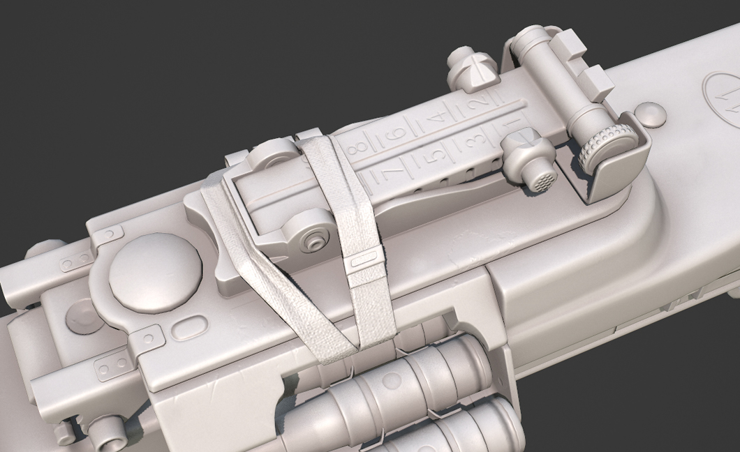
It is worth paying attention to, especially, those shapes that are important – visible. Some connections can be nicely hidden (e.g. by additional stripe of material, sling, etc.). Sometimes thou, preserving the form consisted with the reference is necessary to convey the right image.
![Enrico Santi. Tavor X95 [portfolio online]. 2015, source: https://www.artstation.com/artwork/2q3y](https://piratportfolio.com/fpp_eng/wp-content/uploads/2015/11/5.7.A_III.jpg)
![Trijicon ACOG TA31 BAC Rifle Scope 4x 32mm Dual-Illuminated Horseshoe Dot 223 Remington Reticle with TA51 Flattop Mount Matte [online]. source: http://www.midwayusa.com/product/1583138947/trijicon-acog-ta31-bac-rifle-scope-4x-32mm-dual-illuminated-horseshoe-dot-223-remington-reticle-with-ta51-flattop-mount-matte](https://piratportfolio.com/fpp_eng/wp-content/uploads/2015/11/5.7.A_I.jpg)
5.9. Correction
When using references, a graphic needs to correct some dimensions, to make the solid more firm. Getting rid of curvatures, correcting parts that stick out at a strange angle and straightening some lines make the shape more accessible. Of course, it concerns only minor corrections.
If irregularity is the main feature of an object (e.g. a mace made of a root) it should be expressed, and even highlighted.
![Arkane Studios. <b>Dishonored</b> [PC]. Bethesda Softworks, 2012](http://piratportfolio.com/fpp_eng/wp-content/uploads/2015/11/5.8.A_III.jpg)
![<b>Sturmgewehr 44</b> [online]. <i>source: http://www.muzeumwp.pl/emwpaedia/karabin-automatyczny-sturmgewehr-44.php</i>](http://piratportfolio.com/fpp_eng/wp-content/uploads/2015/11/5.8.A_I1.jpg)
![<b>Unique FN 1900 Copy Melior Semi-Automatic Pistol</b> [online]. <i>source: http://www.rockislandauction.com/viewitem/aid/64/lid/1506</i>](http://piratportfolio.com/fpp_eng/wp-content/uploads/2015/11/5.8.A_II1.jpg)